
What is Mobile Web Design?
In today’s world, people are more inclined to access the internet via their mobile devices than desktop computers. As such, mobile web design has become an essential aspect of web design. Mobile web design refers to the process of creating websites that are optimized for mobile devices. With the right mobile web design, your website can be easily accessible, user-friendly, and engaging on mobile devices.
Mobile web design requires some essential considerations.
Here are some of them:
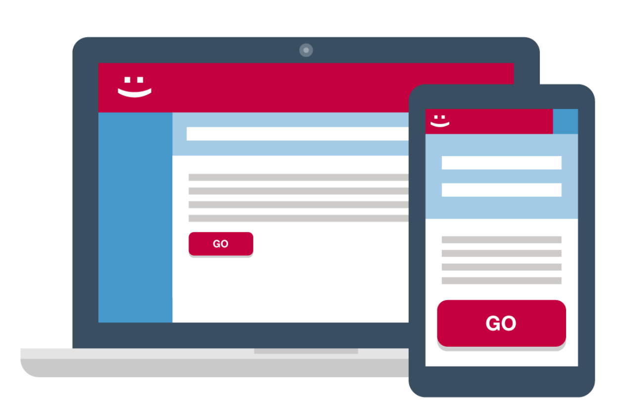
- Responsive Design: One of the most critical aspects of mobile web design is having a responsive website. Responsive design ensures that your website automatically adjusts to the size of the user’s screen, whether it is a desktop, tablet, or mobile device. This feature will allow your website to look great, no matter the device, and help in improving user experience.
- Simplicity: Mobile devices have a smaller screen size than desktop computers, which means that the layout and design of your website need to be simplified. Keep your design simple, and use minimalistic layouts and white spaces to ensure your content is easy to read and understand.
- Navigation: Navigation on mobile devices is different from on desktop computers. You need to ensure that your mobile website has a clear, easy-to-use navigation menu. The menu should be easily accessible and understandable, making it simple for users to move around the website.
- Page Speed: Mobile users are known for their impatience. A website that takes too long to load is likely to lose its audience. Optimize your website’s speed by minimizing image sizes, reducing HTTP requests, and compressing files.
- Touch Screen Compatibility: Unlike desktop computers, mobile devices use touch screens. Ensure that your website is optimized for touch screens. Use larger buttons and links, which will make it easier for users to navigate your website.
- Content Optimization: Mobile users are often looking for specific information. Ensure that your content is optimized for mobile devices. Make your text easily readable, use bullet points and short paragraphs, and ensure that your content is easy to skim through.
- Testing: Finally, it’s essential to test your mobile website across different devices and browsers. Test for usability, accessibility, and compatibility across various platforms, screen sizes, and operating systems.
6 Best Design Tips to Build Mobile Website
When designing a mobile website, there are several design tips that can help you create a user-friendly and effective mobile website. Here are some of the best design tips to build a mobile website:
- Keep it Simple: When designing a mobile website, it’s important to keep the design simple and straightforward. Use a minimalist design with simple, easy-to-read fonts, and avoid cluttering the page with too much information.
- Use Responsive Design: To make sure that your website is optimised for all screen widths, use responsive design. Responsive design adjusts the website’s layout and content to fit the user’s screen size, providing a seamless user experience.
- Prioritize Content: Prioritize content that is important and relevant to mobile users, and make sure it’s easily accessible and easy to read. Use clear and concise language, and break up content into small chunks to make it easier to digest.
- Optimize Images: Use optimized images that load quickly and don’t slow down the website’s load time. Use appropriate image sizes and formats, and compress images to reduce their file size.
- Use Large Buttons and Font Sizes: Use large buttons and font sizes that are easy to read and click on a mobile device. Use a finger-friendly design, and avoid using small buttons and text that are difficult to read and click on a mobile device.
- Test and Optimize: Test your mobile website on different devices and screen sizes to ensure that it’s functioning properly and providing a good user experience. Optimize your website based on user feedback, analytics data, and best practices to continually improve its performance and user experience.
Key Advantages of Mobile Web Design
Mobile web design offers several advantages that can benefit both users and website owners. Here are some of the key advantages of mobile web design:
- Increased Reach: Mobile web design allows your website to be accessible to a wider audience as mobile devices have become the primary means of accessing the internet. By optimizing your website for mobile devices, you can reach a broader audience and increase your website’s visibility.
- Improved User Experience: Mobile web design ensures that your website is user-friendly, making it easier for users to navigate and find the information they need. This improves the user experience and increases engagement and conversion rates.
- Higher SEO Rankings: Google and other search engines give priority to mobile-friendly websites in search rankings, which means that a mobile-friendly website can lead to higher SEO rankings, increased traffic, and better visibility in search results.
- Cost-Effective: Developing a mobile website is generally more cost-effective than building a native mobile application. A mobile website allows you to reach a broader audience without the need for multiple platforms and operating systems.
- Faster Load Times: Mobile web design typically involves optimizing the website’s load times, ensuring that it loads quickly on mobile devices. Faster load times can improve the user experience and reduce bounce rates.
- Competitive Advantage: Having a mobile-friendly website can give you a competitive advantage over competitors who do not have a mobile-friendly website. A mobile-friendly website can improve your brand’s reputation, increase user engagement, and drive conversions.
Conclusion
In conclusion, mobile web design is an essential aspect of web design in today’s world. A well-designed mobile website is more likely to engage users and drive traffic and conversion rates. By following these essential considerations, you can ensure that your website is optimized for mobile devices and can meet the needs of your mobile audience.